What makes WildRoot so special is not only that everything is handcrafted, made right in front of you, but the three friends behind the brand sharing their passion of healthy food and juices with the world. This team prides themselves on the soul behind the brand, which you can definitely see and feel if you’ve had the opportunity to visit in person.
services
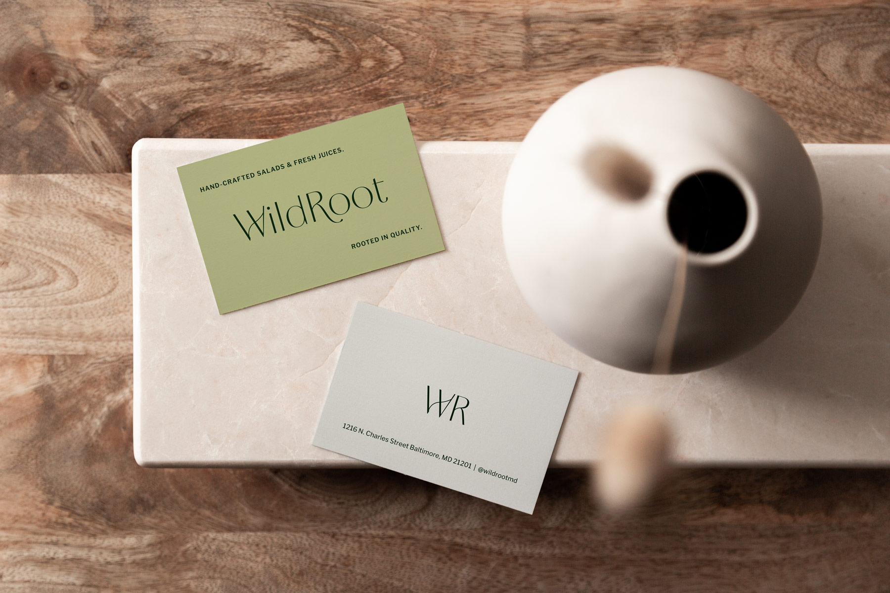
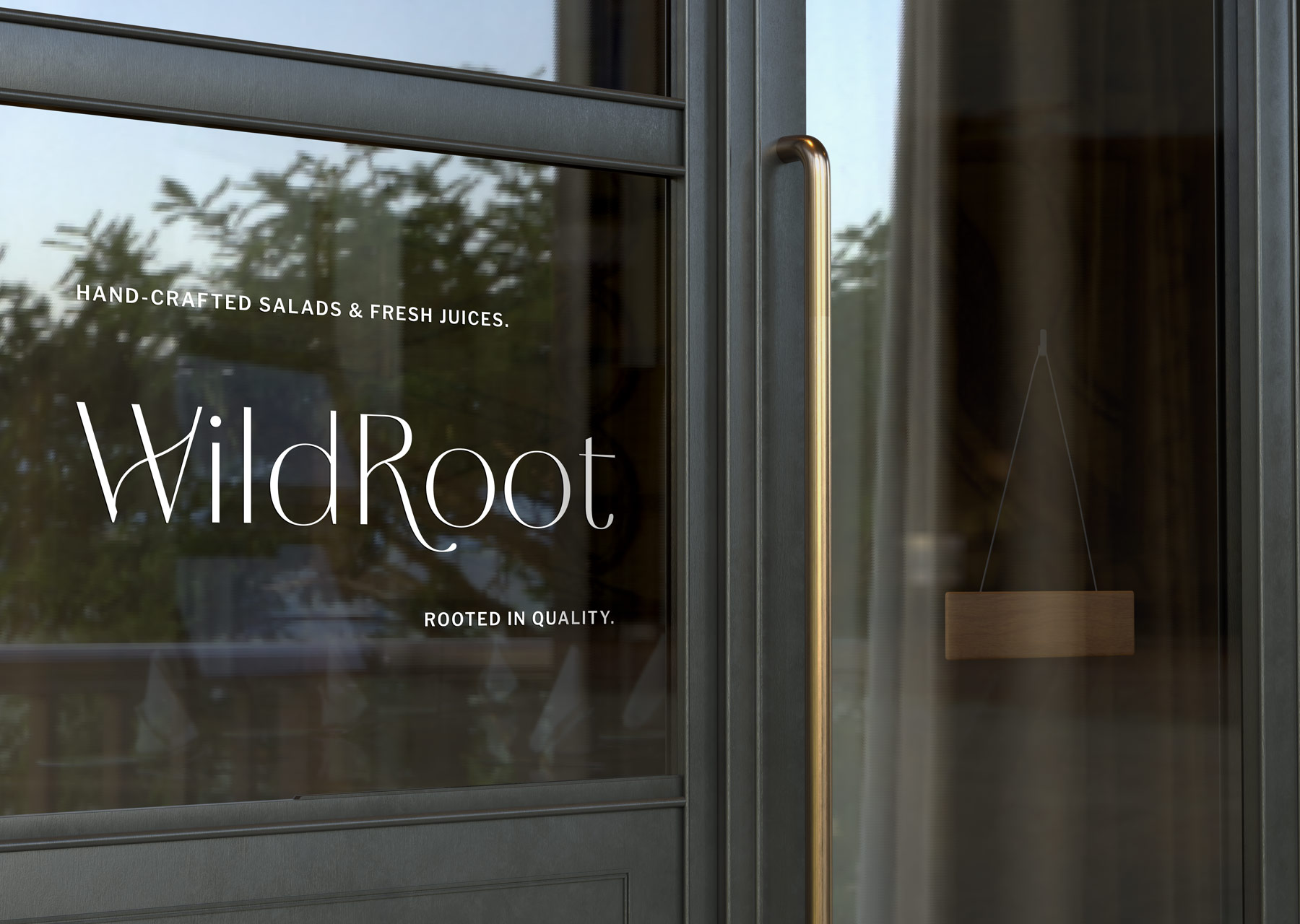
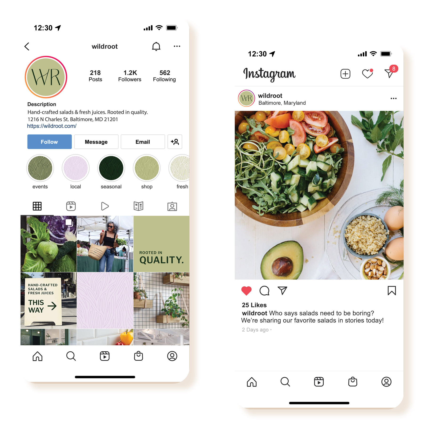
Strategy, Brand Identity, Print Materials, Pattern Design, Social Graphics
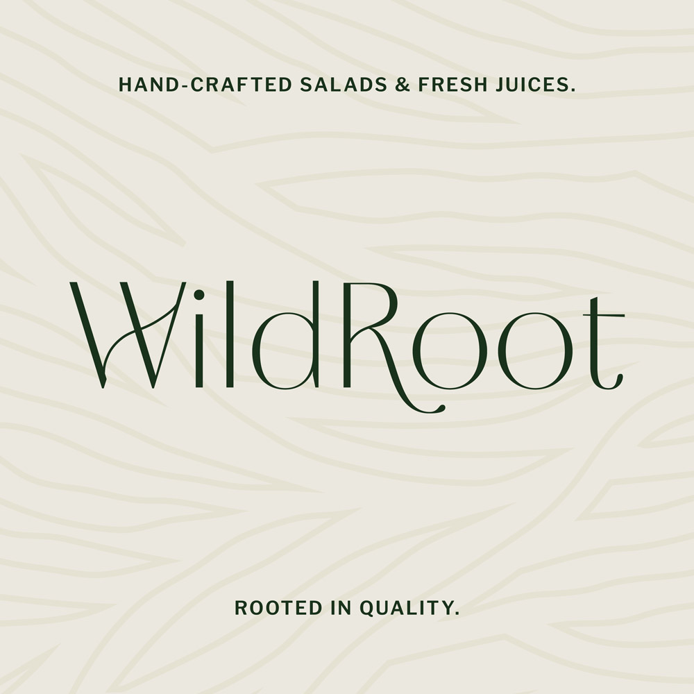
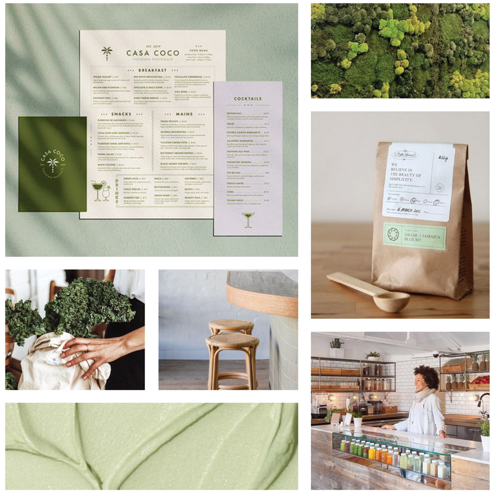
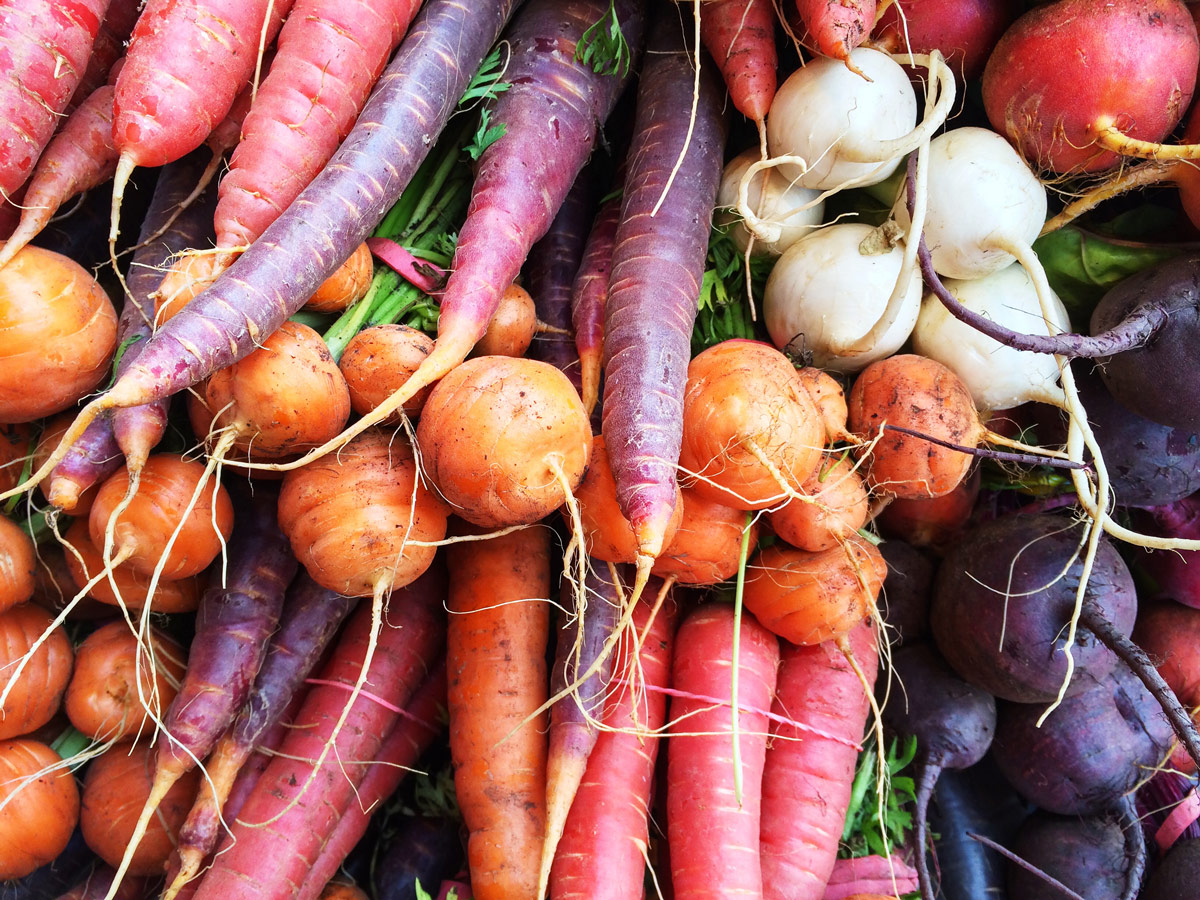
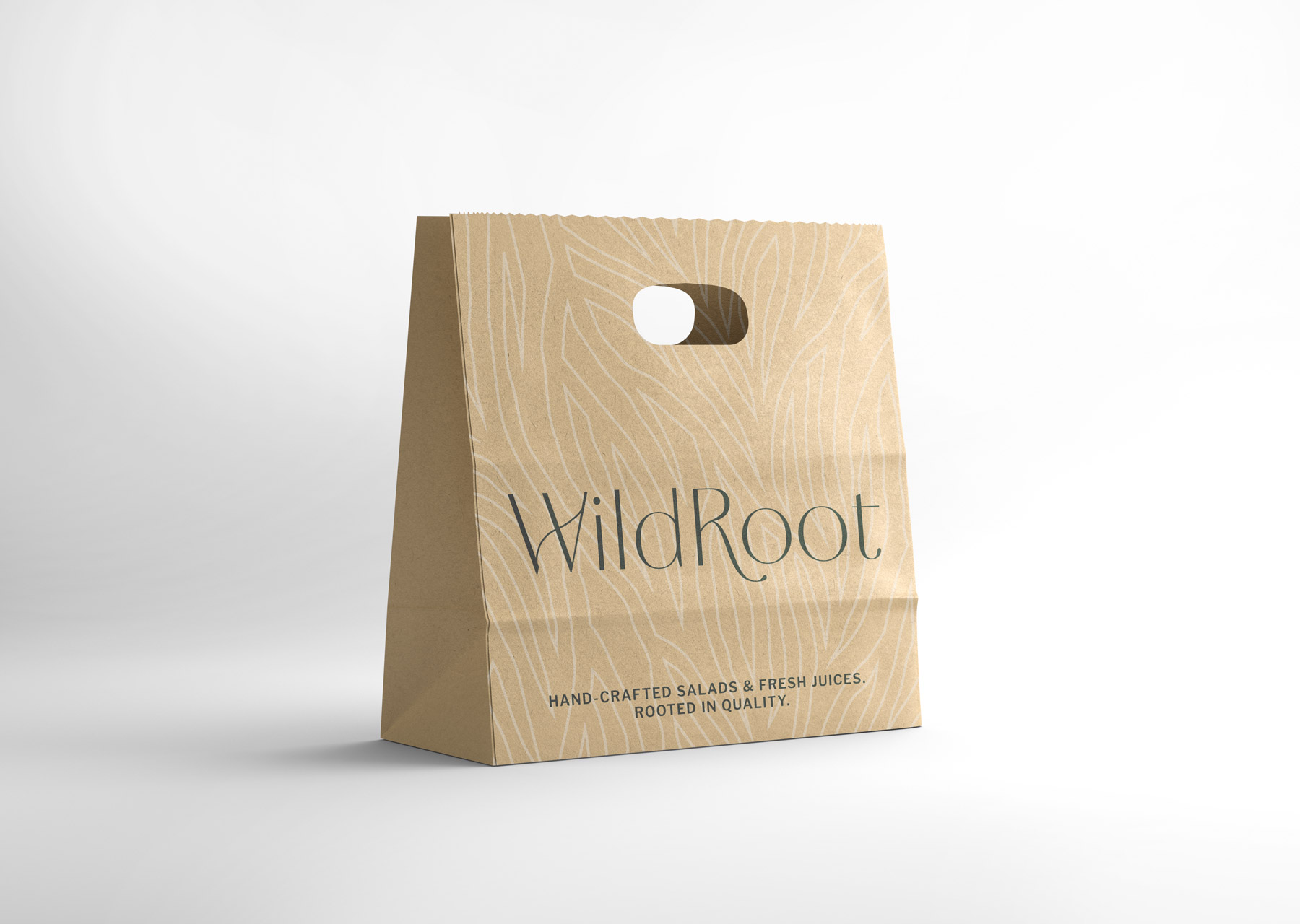
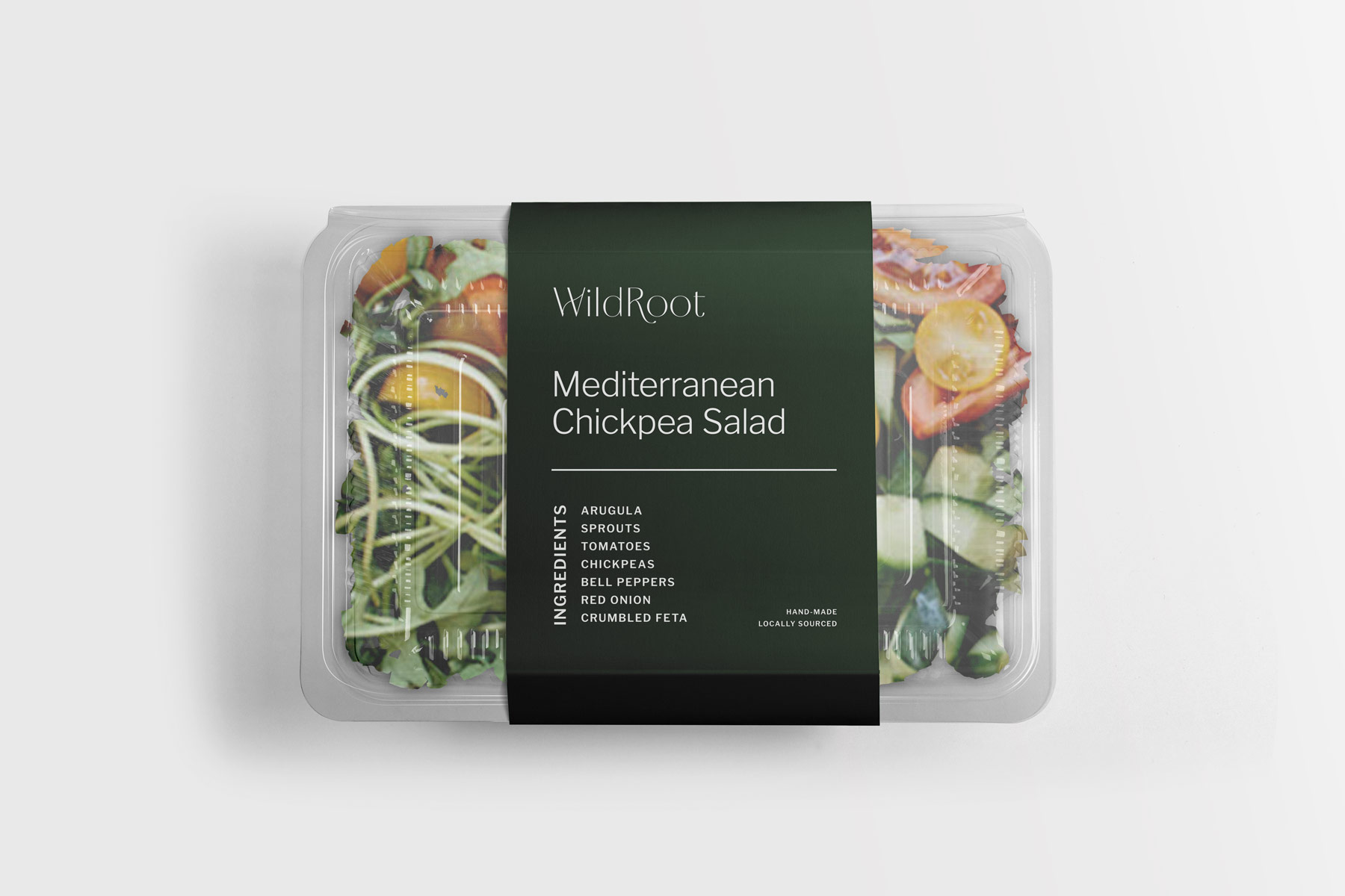
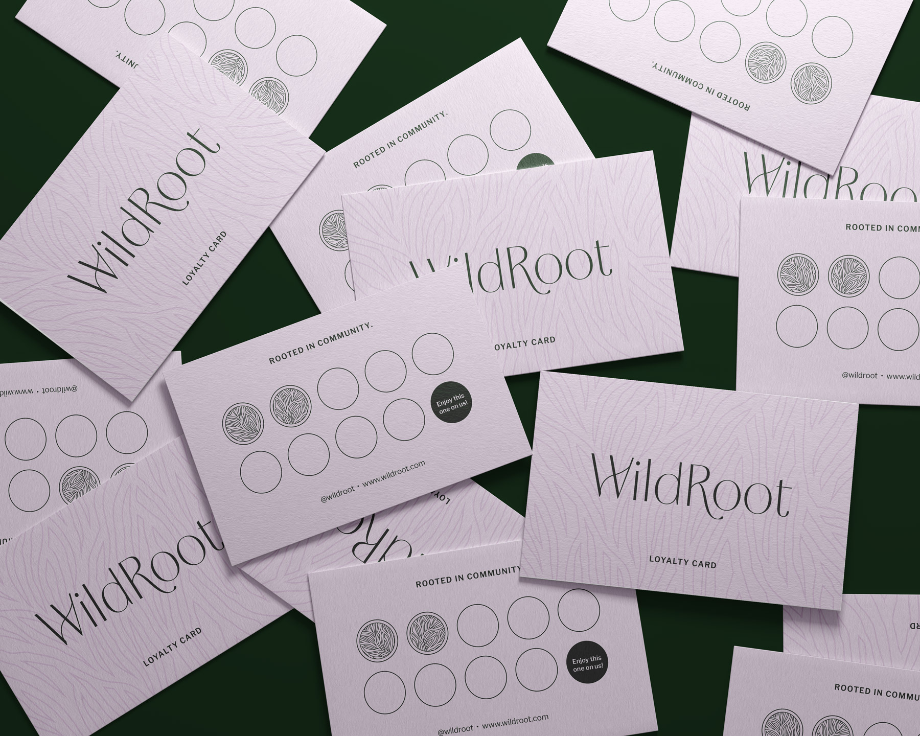
The WildRoot team were so creative and passionate… my kind of people! Their new branding and identity included custom typography for their logo and submark. The unique letterforms were inspired by their brand values, rooted in nods to vegetable plant roots. Their new accompanying brand pattern was intentionally curated and inspired by the name and core values of WildRoot. This memorable pattern element will stand out and be easily distinguished from local competitors.
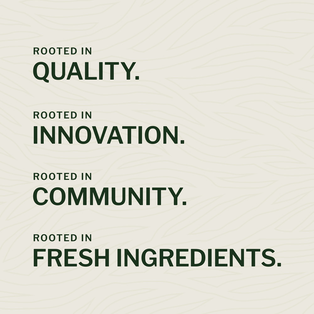
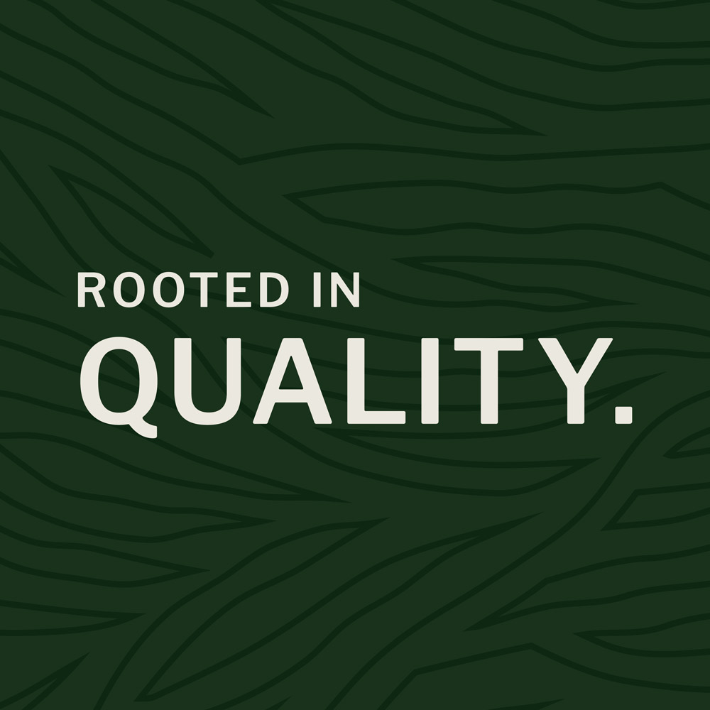
I also had so much fun being creative with their new tagline! I don’t typically dabble in copywriting but we were inspired during the process to create some samples; and one stuck! “Rooted in” offered endless brand opportunities that can stem (pun intended) from the message and we’re loving how it turned out.
VISUAL DIRECTION
Here’s what WildRoot had to say about Little Orange Studio:
“I loved the design work I had seen by Little Orange Studio, and decided it was a must! I think our new branding will set the tone for a very successful business. My experience was awesome and Little Orange Studio is amazing! They took my little idea and dream to the next level. I would recommend them over and over again!”