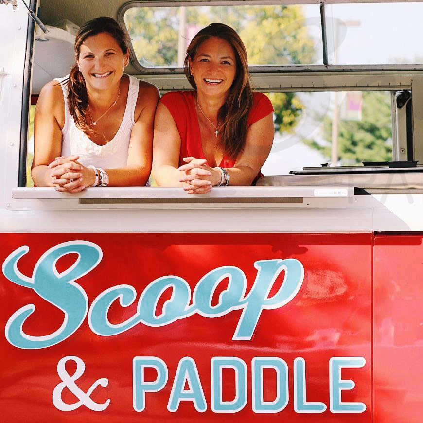
In the early years, Scoop & Paddle owner, Nadine, was passionate about learning what folks loved most about their favorite ice cream and dessert and perfecting her craft.
Scoop & Paddle began with, and still adheres to, the simple idea that the process of making small batch, handcrafted ice cream could be applied in a larger way. Nadine believed the ice cream she made for her clients should be the standard, not the exception, and that above all, it should be delicious. They quickly had the best ice cream and treats around.
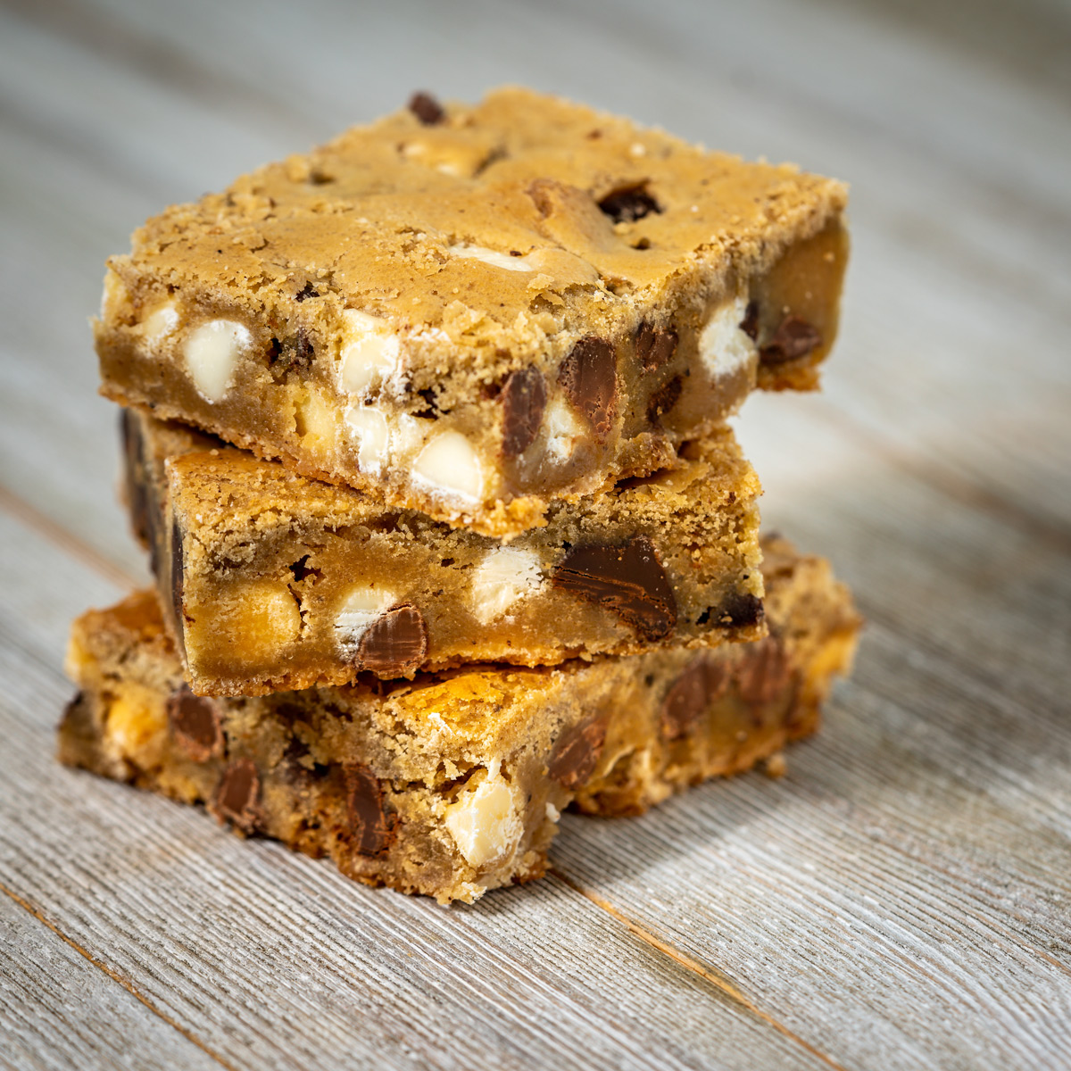
Through the growth and change, one thing has remained constant. Scoop & Paddle has always taken a small batch, craft approach to whatever they create, whether it’s sublime salted caramel sauce, melt in your mouth macarons, or hands down, the best ice cream around.
Scoop & Paddle gives back with their Scoops for Good campaign to pay it forward. They partner each month with a charity that’s working hard to make the world a better place. They create a super limited edition flavor, and the proceeds from every scoop, shake, sundae or pint are donated. Some of the charities they’ve worked with include Thon Nation, Johns Hopkins Children’s Hospital, & Susan G. Komen Foundation.
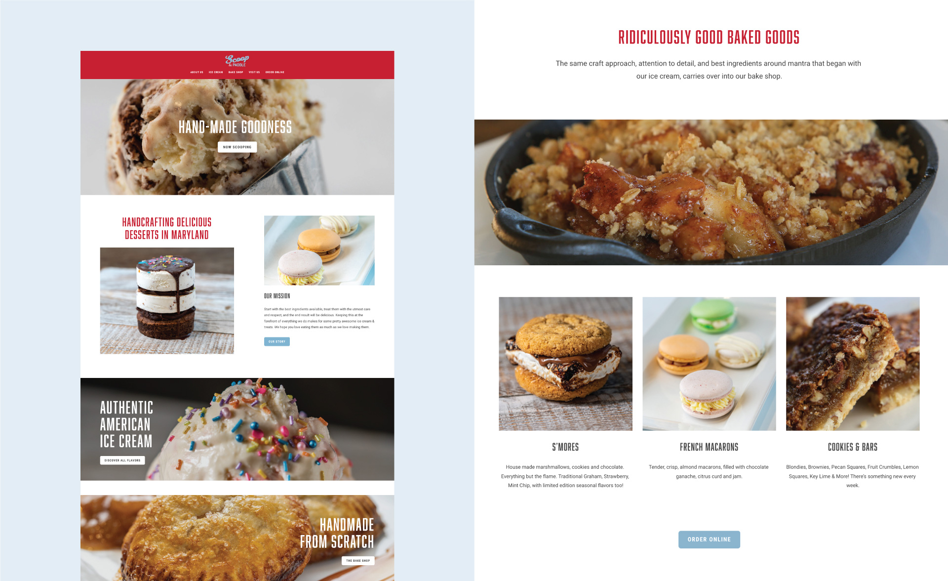
Scoop and Paddle came to Little Orange Studio hoping to create a strong unified brand with a cohesive color palette and new typography to compliment their existing logo. I am so glad they did because what started as a brand refresh with new guidelines turned into one of the most fun ongoing collaborations strategizing and designing new packaging, a new website, custom illustrations, signage, and social graphics.
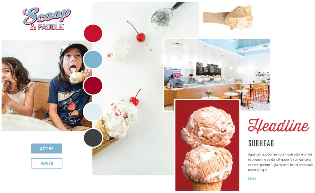
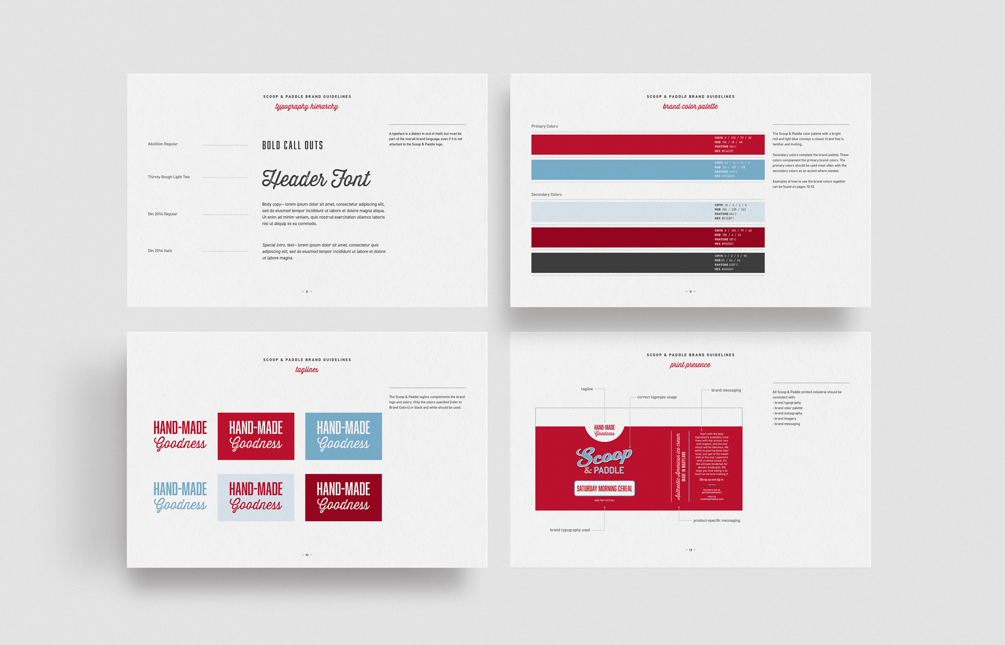
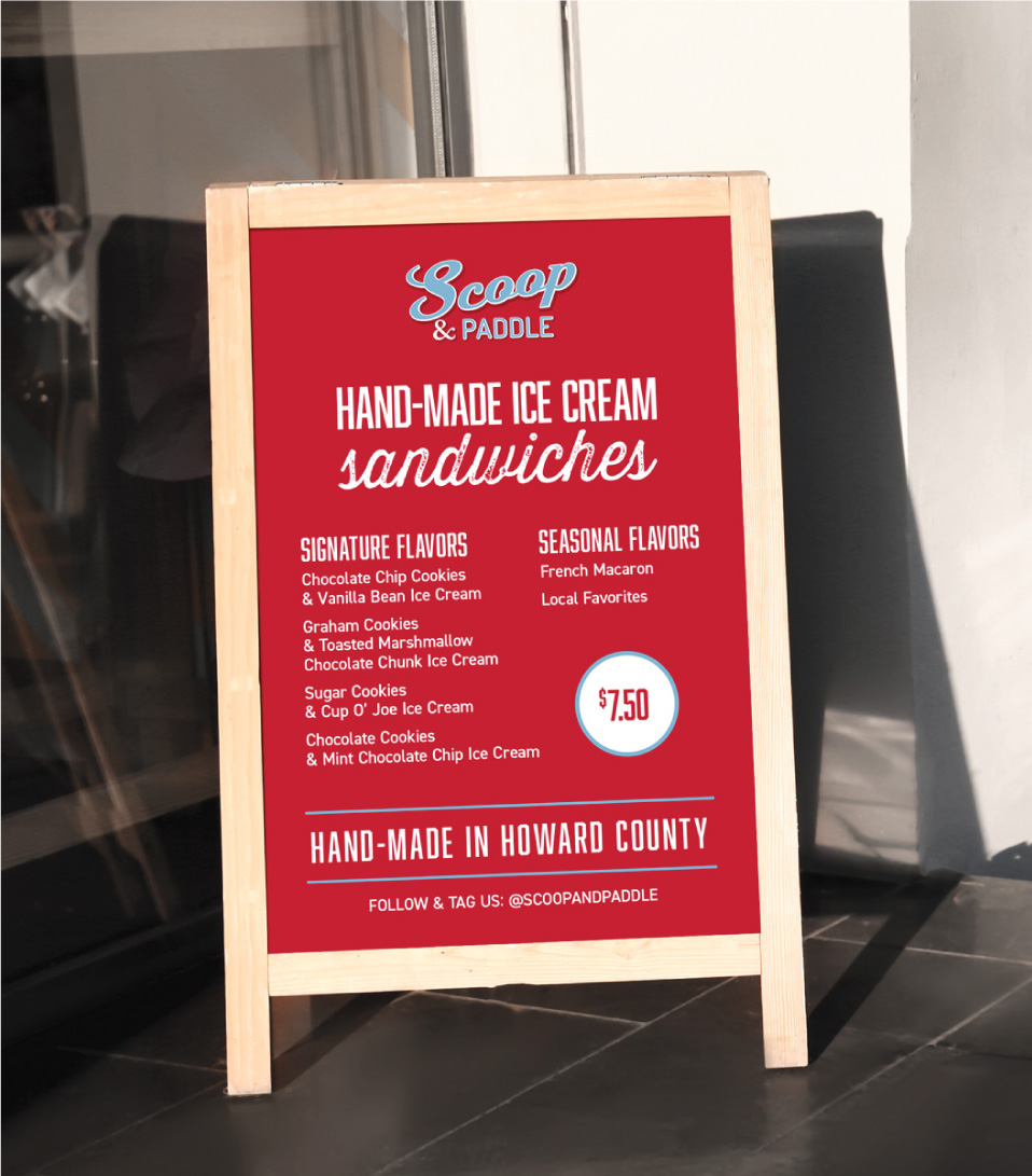
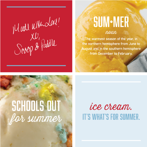
I started by simplifying their current logo and color palette in alignment with a deep dive into new typography for the brand that would align with the long term business goals. Taglines were introduced to compliment the logo on new packaging for pints, ice cream sandwiches and baked goods. These taglines were also integrated throughout the new website, social media with custom graphics, and in the shop.
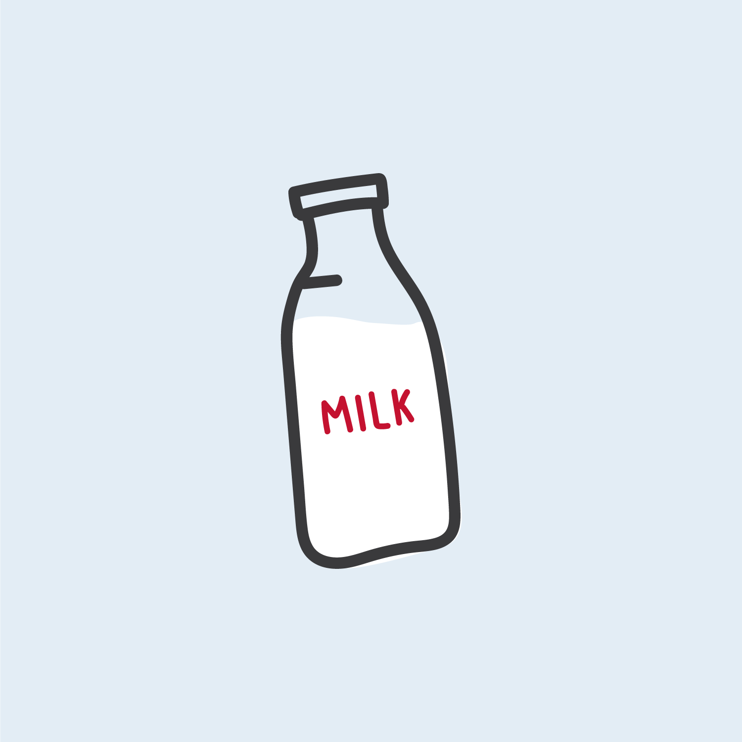
Getting to learn more about how Scoop and Paddle was born as well as the passion that Nadine has for her business has been incredibly inspiring. Custom illustrations and brand accents including custom hand-written type were incorporated into collateral to bring the early days of handwritten flavors and personal touches into the new branding.
visual direction
Here’s what Scoop & Paddle had to say about Little Orange Studio:
“My favorite part of my new website is that it has a consistent look and feel that speaks to our brand. It feels fresh, and allows customers to easily find what they need. Melanie has a great knack for understanding the overall look and feel of my brand. Her super organized approach kept me focused throughout the project. Customers are now easily finding what they’re looking for, and coming back.”