Strategy, Brand Identity, Website Design, Print Materials, Digital Collateral, Social Graphics, Environmental Design
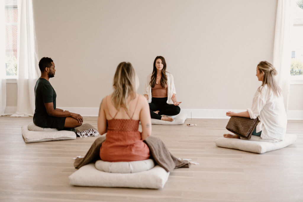
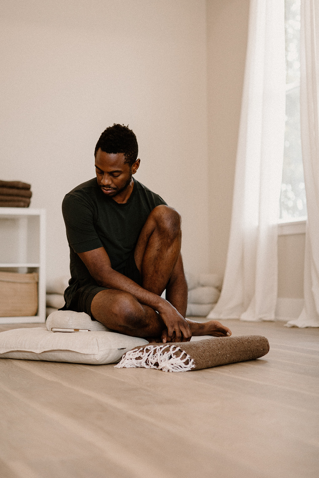
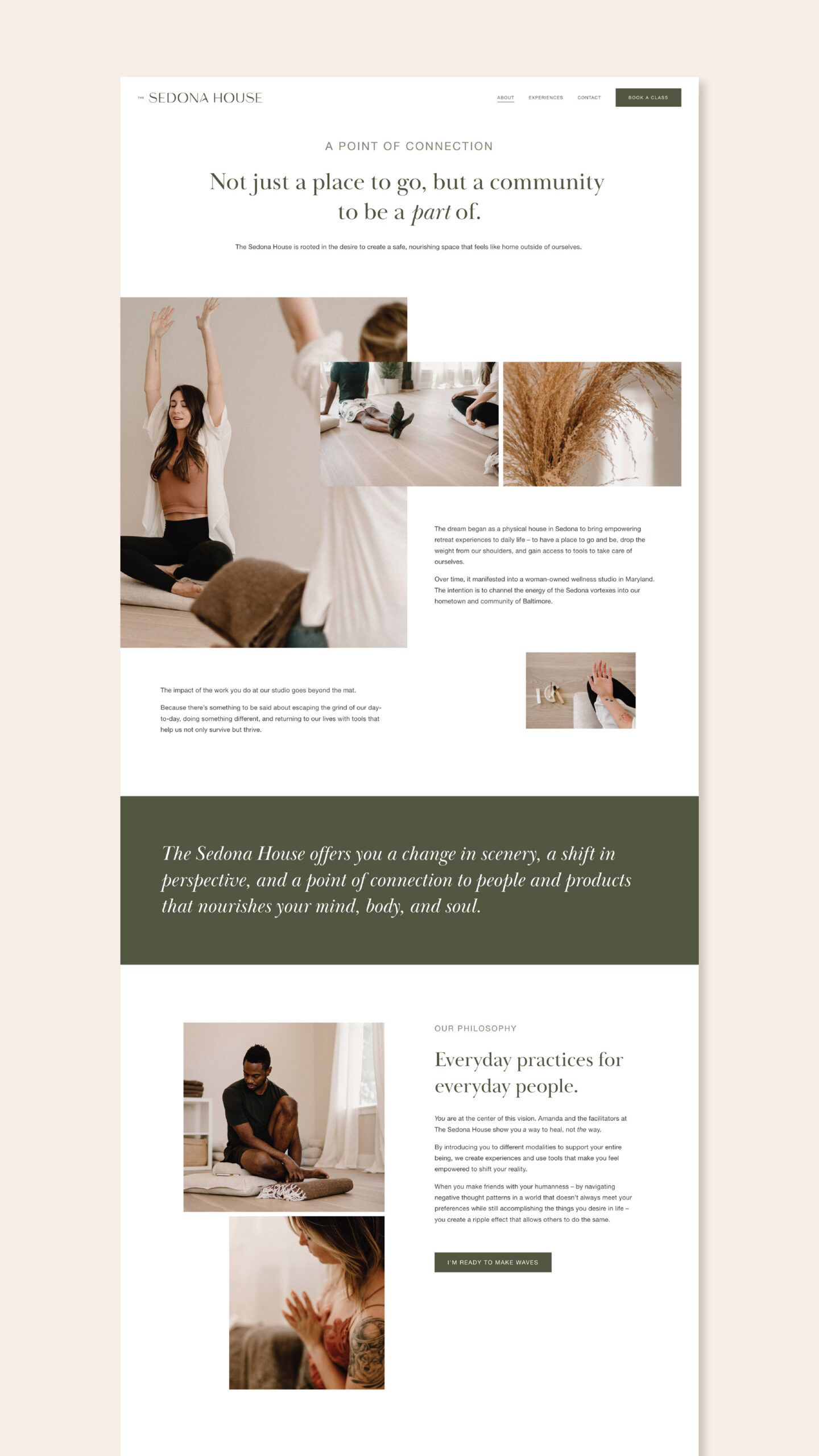
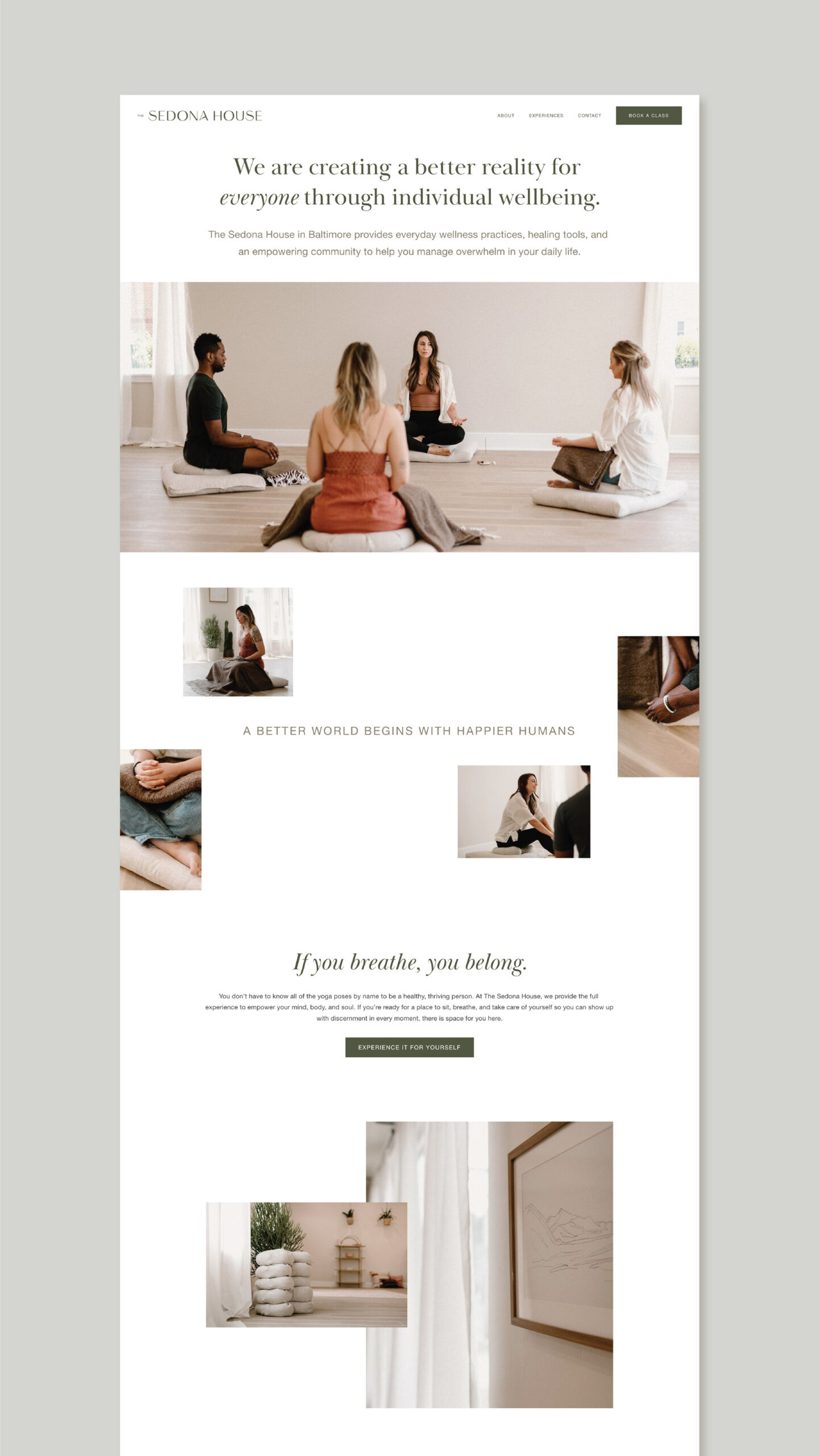
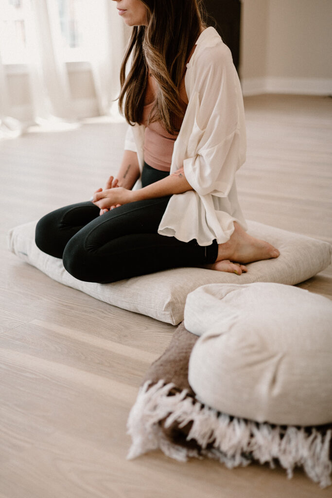
This was yet another dream project and client to work with! The energy, drive, and passion of Amanda at the Sedona House was so inspiring. Her and her team were committed to create a space where people can access a variety of classes for the mind, body, and soul, providing a community of healing that is focused on empowering, encouraging, and promoting happiness. They have a focus on intention, client commitment, and building community. Honesty, integrity, and quality are just a few of their values.
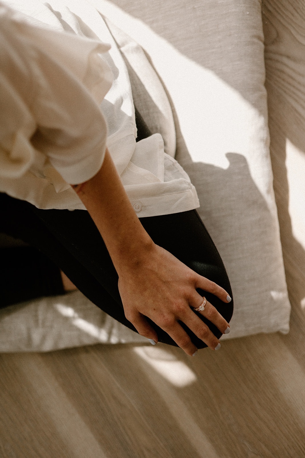
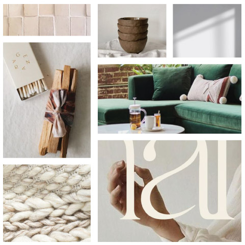
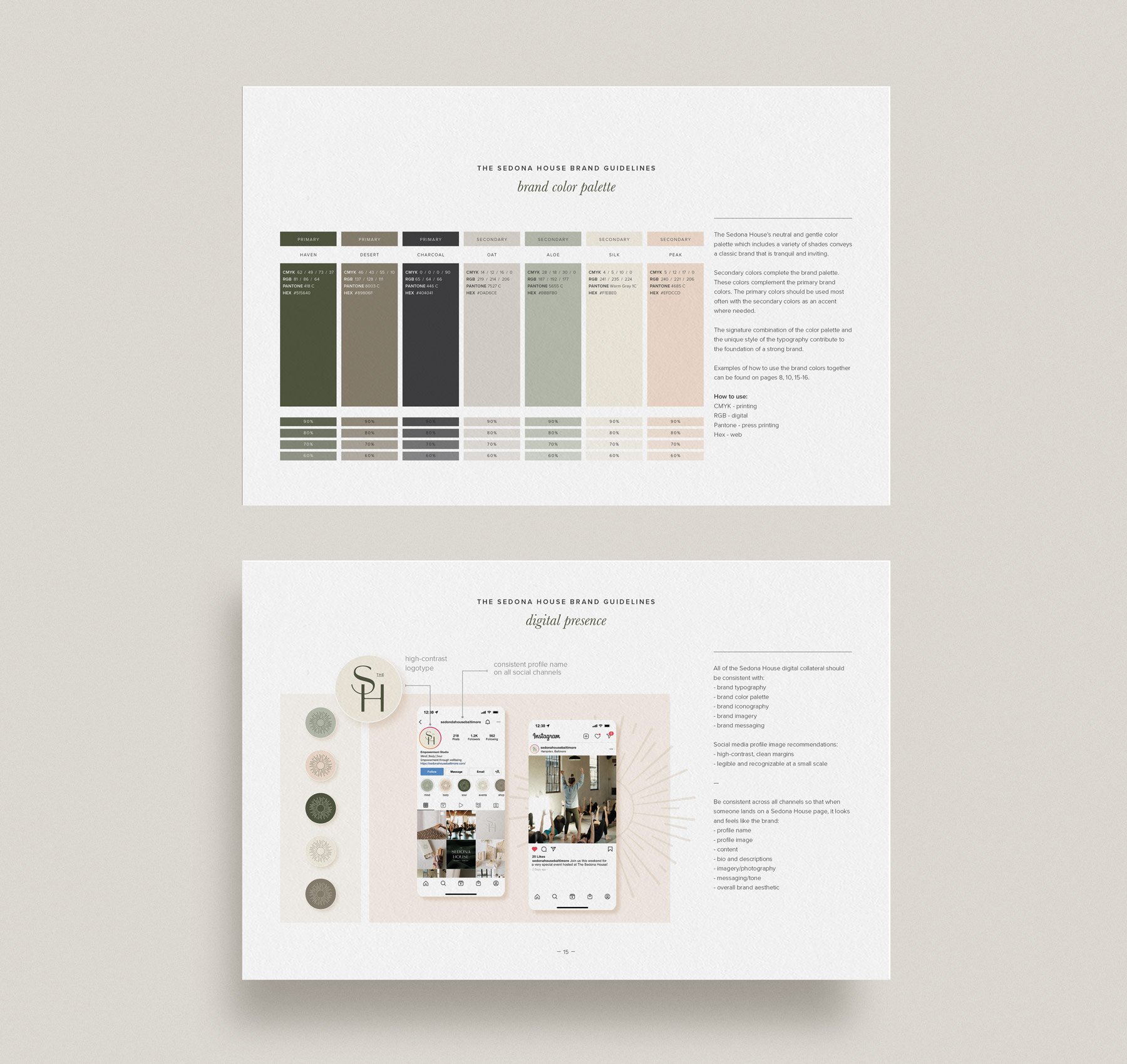
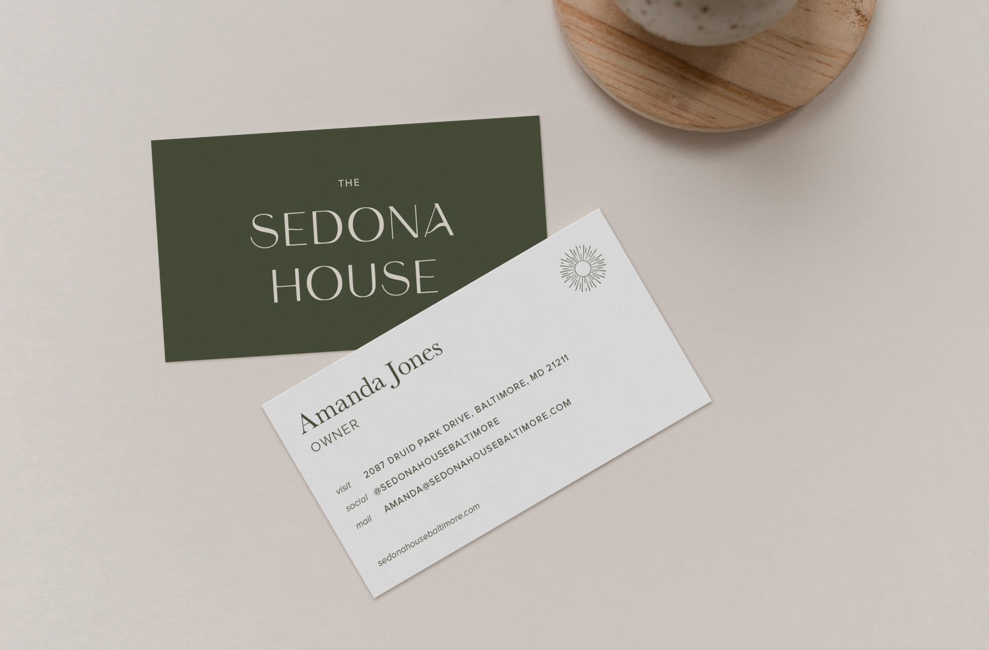
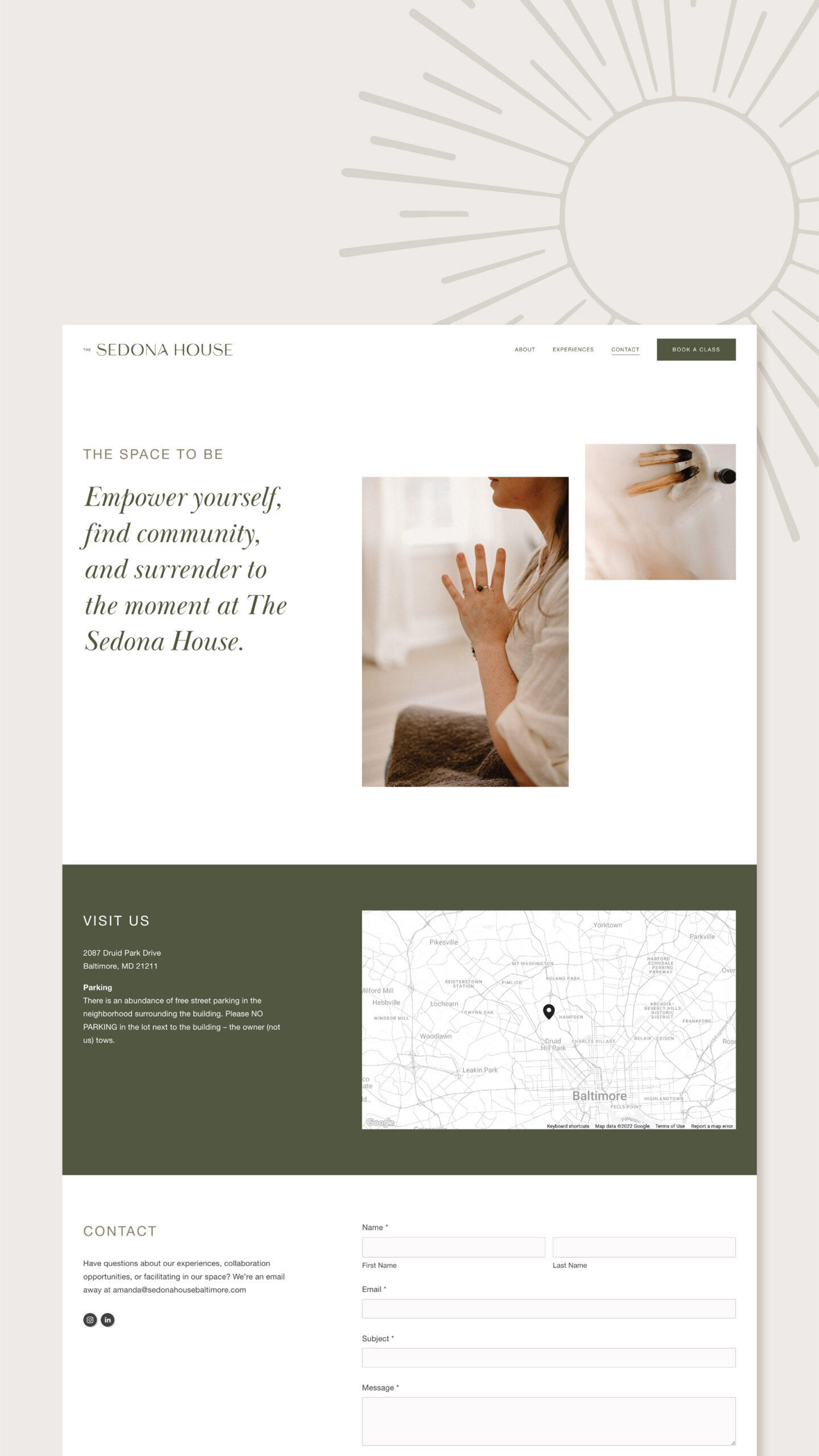
This deep dive of the brand foundation was so fun. I went with a brand style that was welcoming and empowering, timeless and authentic without being overly trendy, inspired by Sedona, AZ but not overly driven by imagery. This included delicate typography with a luxurious high-end and feminine feel, and a neutral color palette that embodied healing and tranquility, all paired with raw environmental materials and textures.
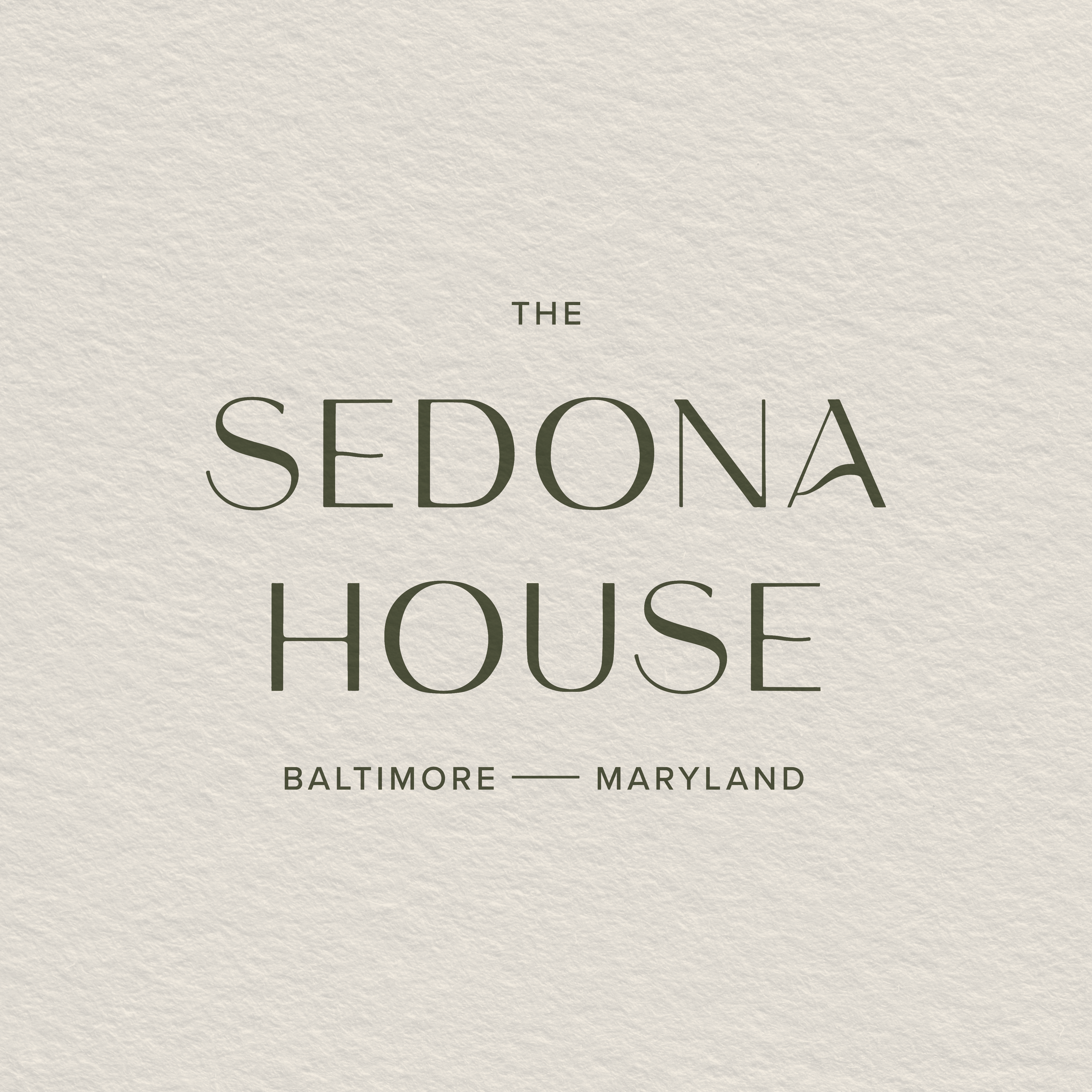
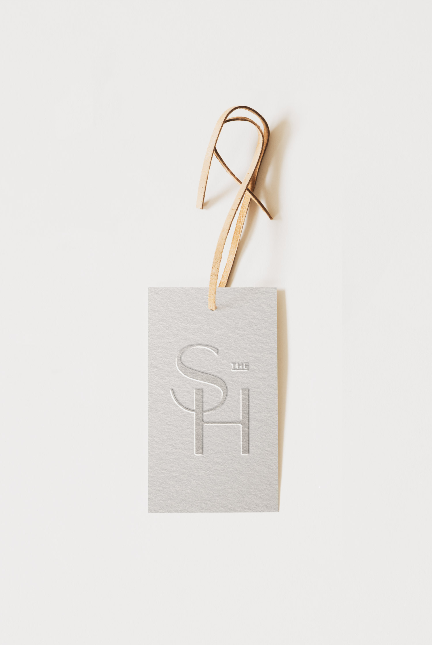
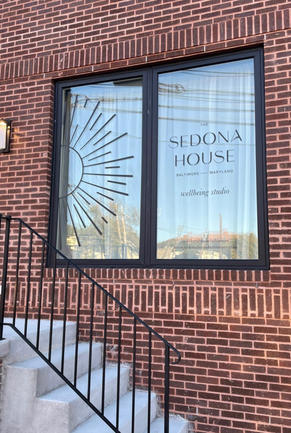
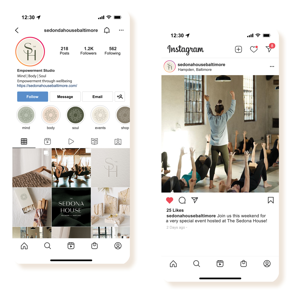
The typography was created with careful attention to detail and inspired by the Sedona landscape with movement. With a horizontal and a stacked version of the logo in the brand, we’ve ensured versatility as the business expands to look equally sharp on any kind of medium – print, web, paper, and packaging. An alternate logo with the location specific mark offers opportunities to expand the brand and also have a permanent impression that is unforgettable for each location.
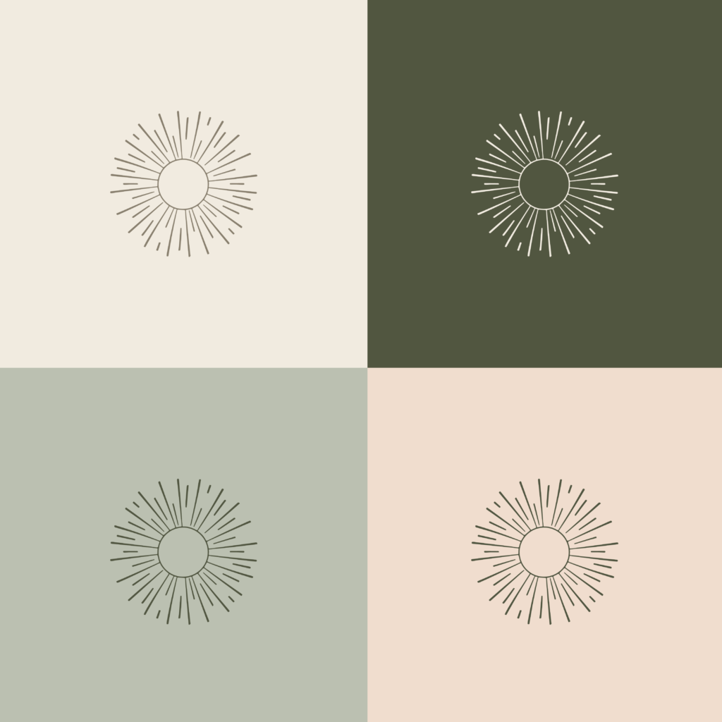
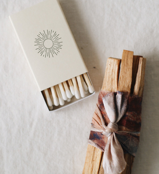
The brand icon was hand illustrated with intentional symbolism. The Sedona region is culturally rich both historically and modern day with Native American influence. The sun symbol was of great importance to all of the Native American Indian tribes and was revered as the provider of light, life, growth, and direction.