

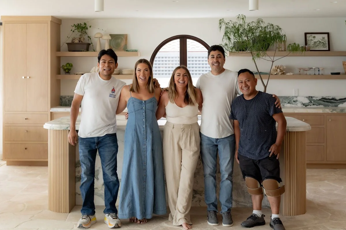
Whit at Home
Based in San Diego, CA, Whit Solomon and her team create homes that truly connect with their clients' unique style, moving beyond trends to discover authentic design solutions. Through their collaborative and thoughtful approach, they ensure clients find joy in their spaces, whether tackling a major renovation or seeking thoughtful guidance. Whit's passion for design, matched with her genuine love for people, makes every client interaction feel like coming home.
messaging in collaboration with: PURPLE PEN STUDIOS
brand photography: jenna jo photo
scope of work
Art Direction & Strategy
Messaging
Branding & Identity Design
Illustration
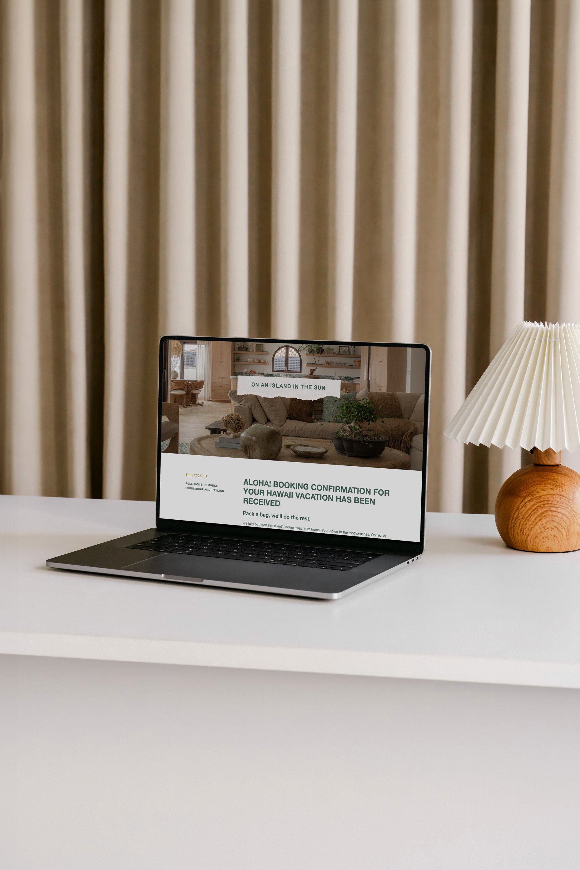
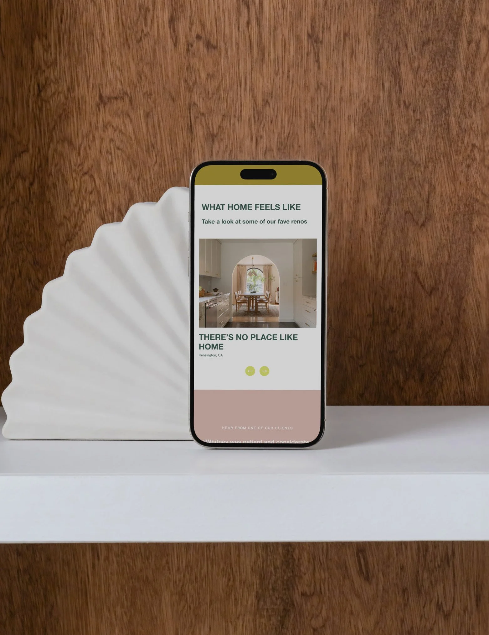
Web Design & Development
Social Strategy
Digital & Printed Marketing Assets
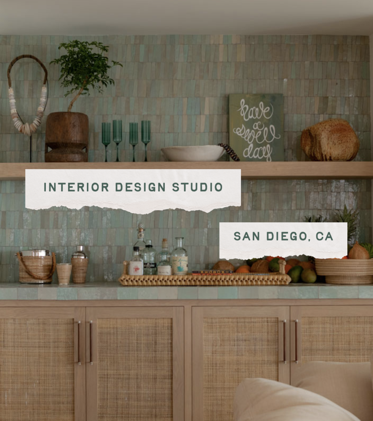
crafting a brand as fun and unique as the team behind it
Just as Whit helps clients uncover their unique style, we crafted a brand that captures the magic of their discovery process. Custom torn paper headlines and playful callouts mirror the joy and creativity that flows through every client interaction. Drawing inspiration from their signature moodboards, we infused the brand with the same energy that makes their design process so magnetic.
The color palette tells its own story –warm greens and blues grounded in trust, accented by bright lime and soft pink that spark joy and creativity. This perfectly reflects the balance of professional expertise and genuine warmth that defines the Whit at Home experience.
Typography becomes the perfect conversation between modern confidence and handcrafted charm, creating a brand voice that resonates authentically with their ideal clients. Every element is purposefully designed to forge genuine connections, making their brand as memorable as their service.
where coastal charm meets personal connection
The hand-drawn logo captures the essence of what makes Whit at Home click with their clients–it's personal, coastal, and completely authentic. Inspired by Whit's own handwriting and San Diego's flowing coastline, the subtle wave motif adds movement while ensuring versatility across all touchpoints.
This identity does more than look beautiful–it creates the same excited anticipation clients feel when working with Whit and her team. From Whit's handwriting to the coastal elements, every detail was crafted to make potential clients feel the unique joy of working with Whit at Home before they even reach out.


“From the moment I met Mel, I knew she was the one for the job. We had a lot of phone time in the beginning–lots of questions about the biz, our ideal clientele, where we wanted to go, goals, all that fun stuff.
As a designer with a vision for *most* things, the rebrand was something I just couldn’t see. I didn’t know what our identity was–all I knew was I wanted my handwriting incorporated in some way (which is now our new logo font), COLOR (no black and white) and FUN. Luckily, Mel got me and rolled with it. We gave her complete creative freedom and a few months later she presented us with the new Whit at Home. Our new brand gives me the confidence to THINK BIGGER and go further.
Mel’s process, attention to detail, genuine care for her clients and creativity makes her a star. Truly, I want to create another company just so we can do this all over again. THANK YOU MEL.”
whit solomon


Want to work together?
Book a 15-minute Fit Call to see if Little Orange Studio is right for you and your business.